I was given a time sensitive task to design a new HUD for Final Stand: Ragnarok. This action PvE style game utilized a new engine that gave players a new experience in gaming.
My role
Spearheaded the UI and UX design of the HUD and other UI needs. Worked with engineers and stakeholders to come up with a feasible design within the constraints.
Design a HUD Game testers needed a working HUD right away.
Modular The game design was still developing, so we needed a HUD design that could adapt to quick changes.
Add some flavor Add some style where we can, so that it’s not completely a dev UI.
Constraints
Our HUD needed to be usable ASAP. We had testers that needed information to play through the game. The game itself wasn’t complete, so a lot of the requirements weren’t set in stone. There were tech limitations, since this game was built off of a previous game.
Development
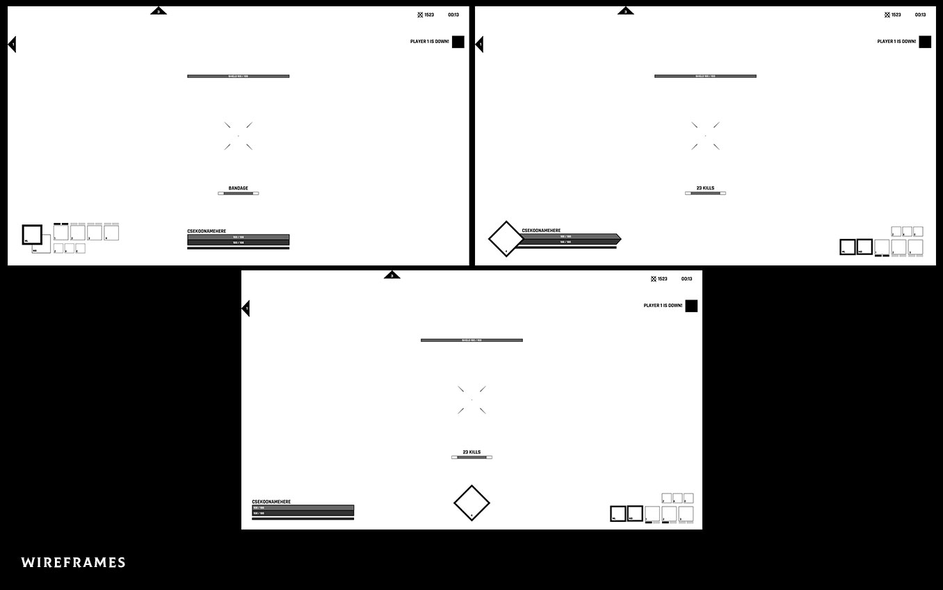
After several iterations, we settled on a HUD layout that we believed would give us the most flexibility while communicating critical information to the player. So that we could complete it within the time constraints, the layout was designed with engineers and artists in mind.
Analysis of test results
During the internal testing rounds, we identified pain points that needed to be addressed.
First experience
Several testers expressed the feeling of being thrown into the game without much information.
Clarity of objectives
It wasn’t clear where the objectives were and what the point was.
Scale
You couldn’t see certain parts of the HUD because the HUD didn’t scale with your resolution.
Back to iterations
As part of our next update to the HUD, I focused on these three pain points. Each point was broken down into specific areas that could be improved to alleviate the overall pain point.
Several testers couldn’t figure out why their abilities weren’t working. We initially thought it was a bug, but in fact, it was just the lack of emphasis on running out of energy. In order to let you know when you are running low on energy, I designed mock solutions that focused on where the player looks the most.
Clean up and simplify
As the development of the game progressed, the player’s HUD was beginning to become cluttered with what we assume will be beneficial to the player. Consequently, important information such as the game objectives was drowned out.
To identify what is critical to the player at all times, I made a hierarchy list. Using this list, I was able to suggest hiding, removing, or reimagining the way tertiary data is displayed. The result was a clearer understanding of objectives.
Scaling challenges
We were unable to scale the HUD according to the screen size of our users due to technical constraints. In theory, this tech feature would instantly solve one of the problems users were facing.
In an attempt to find a temporary solution, we assumed that our primary users’ resolutions were greater than 1080p. Therefore, at 1440p, I made sure that all of the HUD could be clearly seen by users. Since parts of the UI overlapped when using the lower resolution HUD, I had to adjust the sizes so that the elements didn’t overlap each other. As a result, we had a temporary HUD that worked well for most of our users.
Results
Based on the constraints, I created a HUD system that allowed users to play through the game. In order to allow iteration without artists, I designed a system that utilized CSS instead of raster images.
Looking back
In retrospect, I should have explored more options for the layout of the HUD. As we progress in the development process, it becomes more difficult to make large changes because users become accustomed to the current system.
Additionally, I should have chosen fewer colors for the UI. I encountered new constraints when I decided to use colors as identifiers. Example: Since the shield bar is blue, it caused confusion when blue was applied to show someone being frozen. In the long run, it could have been better to use a more desaturated palette.